These days, it’s less about picture-perfect interiors and more about creating a home that’s perfect for YOU. And while people have enthusiastically embraced this personally-perfect maximalist design philosophy, it has come with its own set of challenges – the largest being how to blend decor that spans both styles and decades.
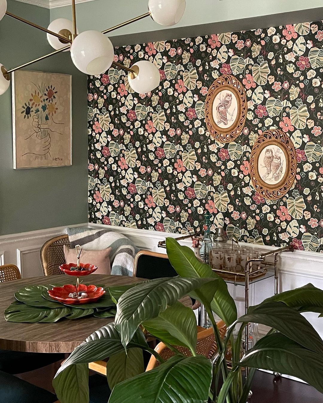 |
| Design and Photography by Ashley Riela featuring Gwyneth Dark Green Floral wallpaper |
Striking the right balance between modern and vintage decor requires some extra thought, but the results are seriously worth the effort. With some trial and error and these tips to guide you, you’ll be well on your way to finding your own perfectly eclectic blend:
Step One: What's Your Balance between Modern & Vintage Decor?
Determining the overall balance between modern and vintage decor in your space is a great place to start. For instance, are you looking to add antique accents to soften and bring character to a contemporary space? Or are you looking to complement a largely vintage-inspired design with sleek, modern lines?
Deciding which style will serve as the foundation for your space and which will be the complementary accent will help prevent chaotic clutter. And as you look to source or swap out new pieces, understanding this balance will help you make targeted choices that complement your overall look.
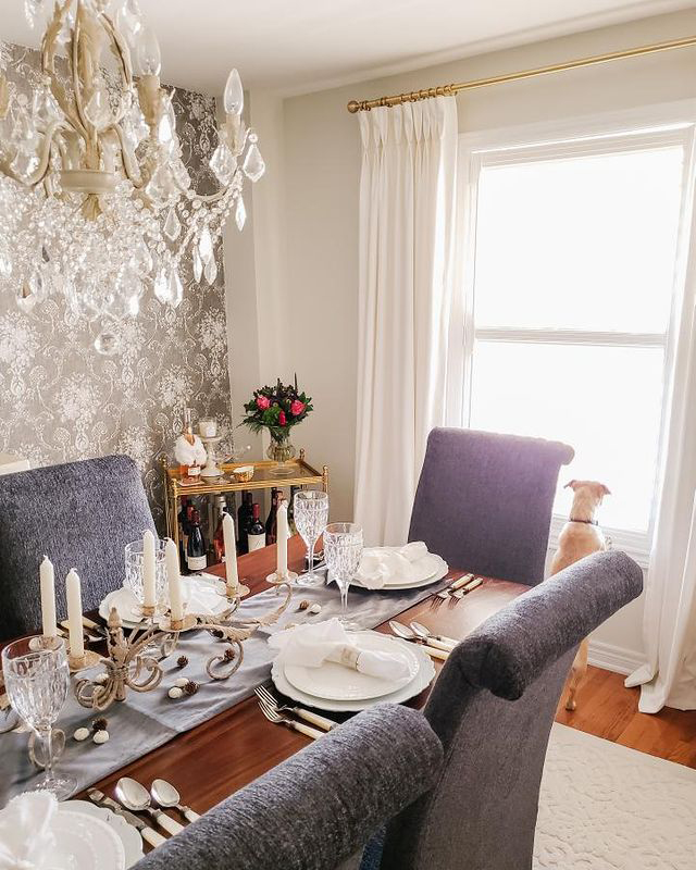 |
| Design and Photography by Lora Currie featuring Winsome Grey Floral Damask wallpaper |
Step Two: Executing Your Look
Now that you understand your desired balance of modern and vintage decor, it’s time to think about the elements you’ll use to support each look!
When it comes to your predominant style, your larger design elements will help cement it as your foundation. Large furniture pieces, curtains and wallpaper are all great elements to consider when establishing your primary design influence, as these elements create the overall backdrop of your space.
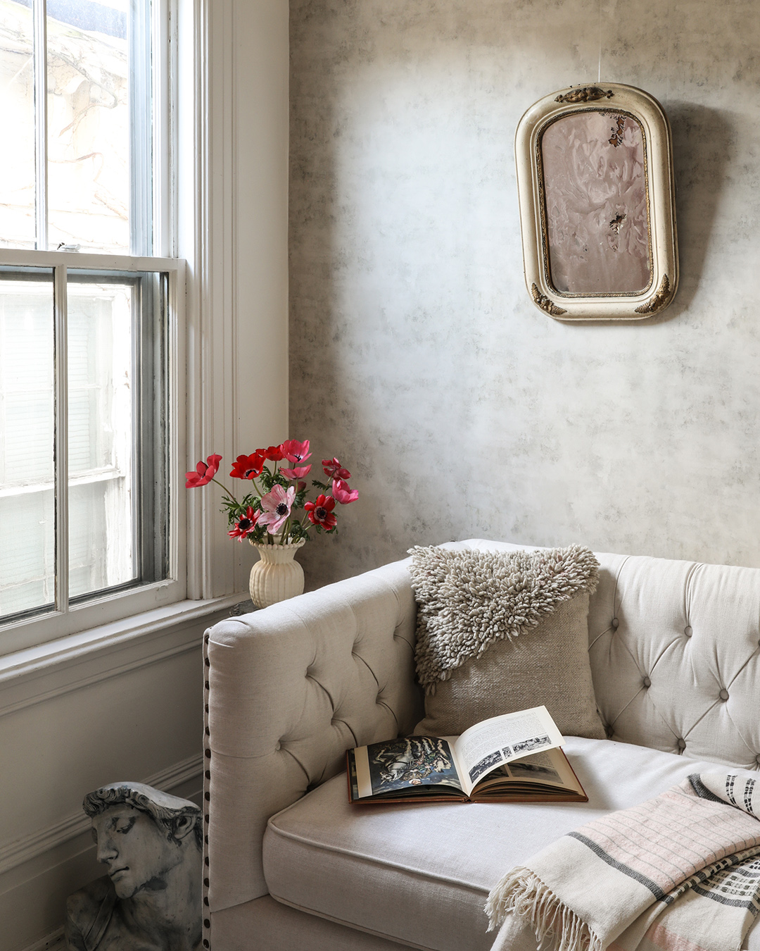 |
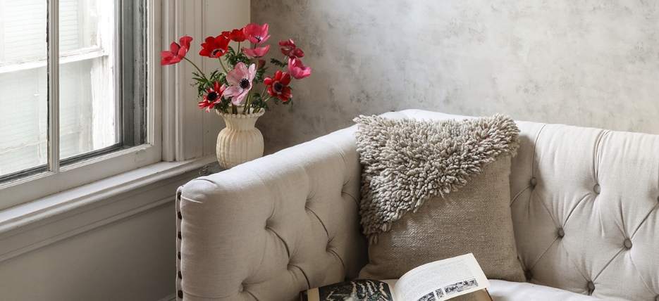
| Add historic charm to any home with the timeless, Old-World elegance of the Zio & Sons wallpaper collection. The Artisan Plaster design, featured here, is especially perfect for creating an elegant and antique backdrop with its realistic and artful take on Venetian plaster. |
In turn, accent pieces are perfect not only for building in that secondary style, but also for bringing bold pops of personality to your space! The key, however, is to NOT. RUSH.The most successful maximalist spaces find JUST the right accent to complement their interiors. It takes patience and persistence to find the perfect piece to fill that form and function gap, but the result is one-of-a-kind design that you’ll love to the fullest!
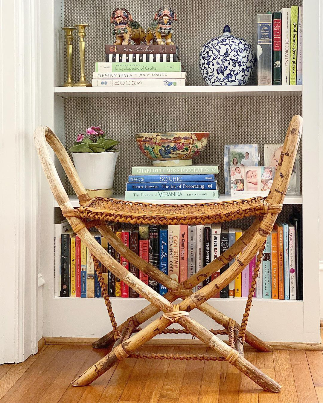 |
| A bookcase full of accent piece perfection! Design and Photography by Cameron Jones Interiors featuring Gaoyou Taupe Paper Weave wallpaper |
As you bring in new accents that span styles and decades, being mindful of a few key elements will help you maintain design cohesion. First and foremost is color. Color is an extremely powerful design element that can bridge the gap between numerous design influences. By sticking to a concise color palette – we recommend one dominant color and no more than two or three accent colors of a similar hue – you can create harmony between decor with vastly different styles.
Too much of a good thing, however, can bog your design down. Incorporating contrast helps maintain each element’s unique charm and allows your eye to naturally move around your space. Consider bringing in different materials, mixing hard lines with soft curves, and playing with scale.
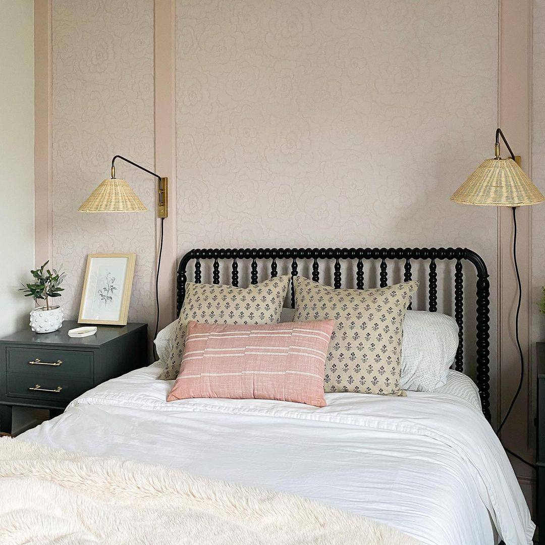 |
| This bedroom Jennifer Gizzi designed for her daughter is a great example of putting these tips into practice! Blush pink accented by neutral tones and black highlights; a blend of straight lines and fun curves; a mix of metallic, wooden and woven accents - it doesn't get much better than this! Featuring Periwinkle Pink Textured Floral wallpaper |
However, there’s always an exception to the rule. If you have a statement piece, it is often a disservice to try and blend it into your existing decor. Some pieces are so fabulous in design and ornamentation that they deserve to remain a focal point; attempting to incorporate it into your overall design can either diminishes the piece’s impact or skews your room’s overall look.
Feel empowered to continue your personalized maximalist design journey? Follow us on Instagram for inspiration and share your progress (especially when you use wallpaper!) by tagging us in your updates!


