It can be easy to overlook the transitional spaces in your home; areas you don’t linger in, hallways that simply bring you from point A to point B. It would a mistake, however, to assume that the design of these spaces – or lack of – has no impact your home.
Transitional spaces – like your entryway, hallways and stairwells – not only set the tone of the rooms they connect, but they also amplify and provide continuity to the rest of your home. It is understandable that styling these spaces wouldn’t be your first priority, but you certainly shouldn’t forget them entirely!
To help you uncover your home’s untapped potential, we are highlighting three transitional areas that are extraordinary in both form and function.
Hallway Reading Nook
Hallways are typically functional dead space; they connect and provide access to the different rooms in your home, and that’s usually it. However, depending on the layout of your home, your hallway may boast some significant floorspace that is left entirely underutilized.
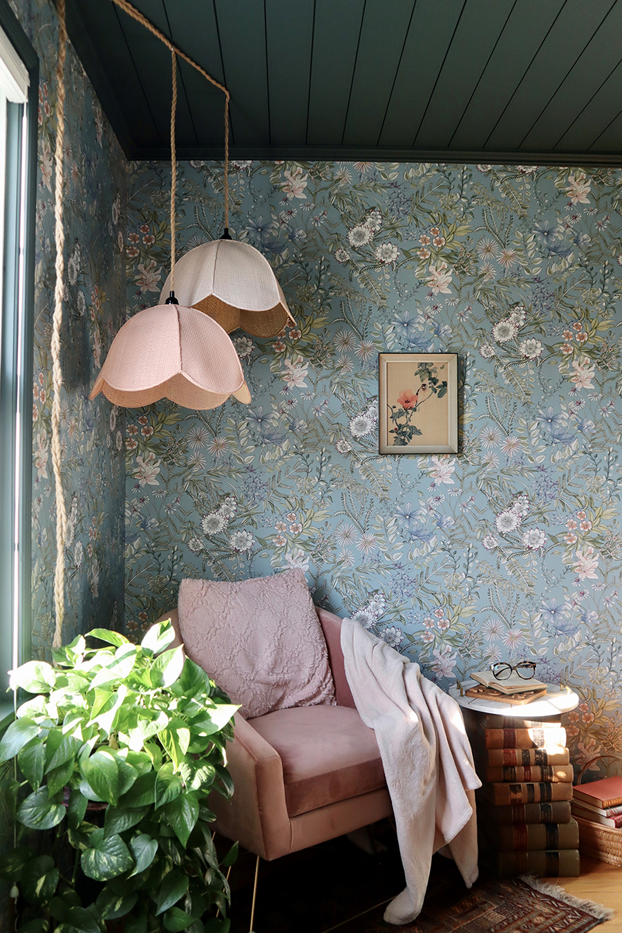
While working to turn her new house into a forever home, Lana DeFrancesco couldn’t help but notice the potential of her upstairs hallway. A dramatic dark blue-green paint job on the stairwell highlighted how sunny and soothing the upstairs space was. With the hallway readily visible from the front entry, it was the perfect space to add some fun design to!
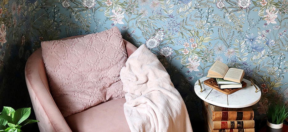
To compliment and soften her dramatic stairwell, Lana chose a gorgeous, vintage-inspired floral wallpaper. The delicate blues and pinks balance the darker tones, while the leafy details act as a bridge between the florals and existing hallway color.
 |
| Design and Photography by Lana DeFrancesco @lanadefrancesco_ Featuring Full Bloom Blue Floral Wallpaper |
To take advantage of the sunshine, Lana crafted a gorgeous reading nook in the sunny corner. The blush hues of the chair and thrifted lampshades bring out the colors in the wallpaper and add to the feeling of cozy relaxation. To accommodate the small space – and add to the ambiance of this charming reading nook! – she crafted an end table by topping a stack of old books with a marble serving tray.
Lana calls this space her secret garden – which couldn’t be more on the nose for this peaceful corner! We can see ourselves spending many a quiet moment here – can you?
Showstopping Staircase
Speaking of upstairs, your staircase is another underutilized design space. Most people transform their staircases into gallery spaces to showcase treasured family photos and art pieces – which is fabulous! But as the bridge between your first and second floors, your staircase has tremendous potential to provide unified style as you move throughout your home.
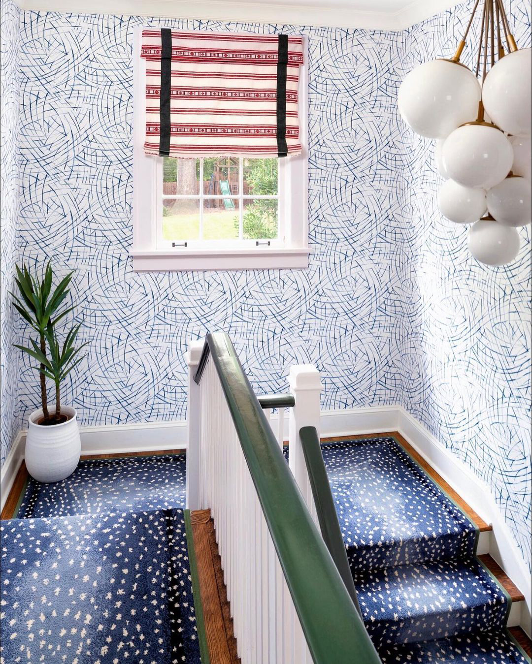
Take this stunning entry and stairwell; not only is it the first thing you see when you walk in, but this winding staircase sets the tone for both the second and main floor. Which explains why interior design Gina Sims paid such careful attention to detail when crafting its design.
 |  |  |
| Design by Gina Sims Designs @ginasimsdesigns Photography by Cati Teague @catiteaguephoto Featuring Willy Nilly Blue Brushstrokes Wallpaper | ||
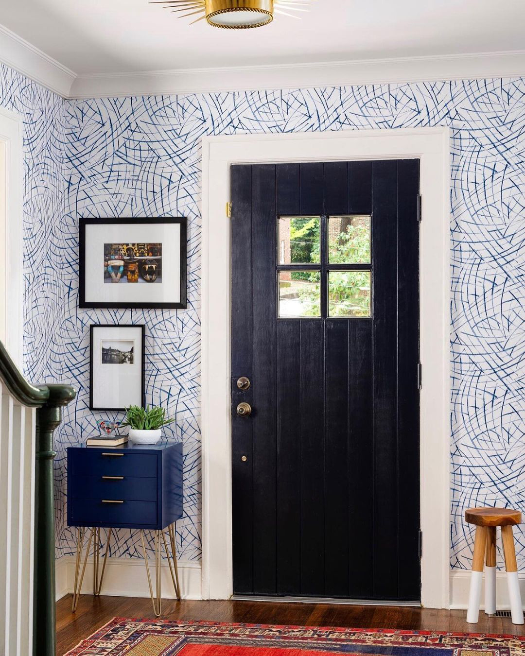
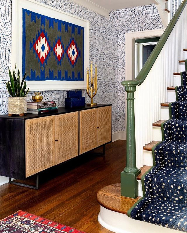
The wrap-around staircase gave Gina lots of wall space to play with. To dress it up, she chose a whimsical blue abstract wallpaper. The flowing design adds to the stairway’s sense of movement, while the blue brushstrokes introduce bold yet balanced color to the corridor.
Gina chose a gorgeous southwestern tapestry in the entryway hall as the color inspiration for the rest of the space. She painted the bannister the same rich green, played with pops of red on the curtains, and chose the most perfect speckled, sapphire-blue runner trimmed in matching green. The overall effect is modern, inviting and oh so polished – a perfect blend of design and personality to unify all the areas of this home.
Mudroom Masterpiece
Sometimes the transition between inside and outside can be a challenge. Whether it’s juggling groceries, dealing with muddy shoes, or having a place to stash packages, your entryway deals with a lot. Give this space the functionable and fashionable update it deserves with a mudroom makeover.
 |
Design by Wendy Mauro Design @wendymaurodesign |
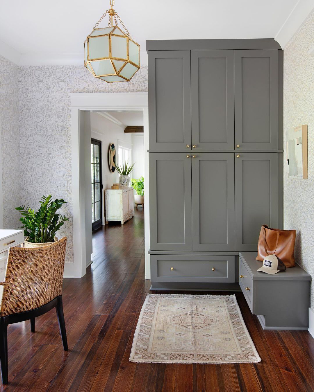
Interior designer Wendy Mauro utterly transformed this back door entrance for her bustling clients! To achieve the ultimate balance of functionality and style, Wendy shifted the space around; she had new walls put in and moved doorways to create a better flow – a must for congested, high traffic spaces. She then brought in some beautiful storage cabinets to keep shoes, coats, bags and other necessities close at hand but neatly tucked away. The extra organization even left room for a desk, perfect for writing a quick grocery list or stashing grab-and-go items like keys and sunglasses!
To give the now-functional entryway character, Wendy wrapped the space in a cheerful and contemporary dotted wallpaper. She painted the cabinets a matching grey and accented the yellow with gold hardware and a gorgeous, glass-paned chandelier. The overall effect is bright and welcoming, both a beautiful transition into the heart of the home and moving from inside to outside and outside-in.
Are you feeling inspired to revisit the design of the transitional spaces in your home? Tell us your plans by dropping us a comment below and be sure to follow us on Instagram and Pinterest for more inspiration!
