Color is a powerful communicator. Not only does it embody a mood, but it can influence ours.
Over the past several years, personality-packed and colorful interior design has soared in popularity. In the face of an increasingly alarming and unpredictable world, it seems we have instinctually sought to transform our homes into havens of optimism and joy.
Sound too drastic, or maybe too dire, to be true? You might be surprised to learn there’s a precedent for this reflexive movement towards colorful homes.
Dorothy Draper’s joyful and now iconic stylings first rose to prominence at the precipice of global dismay. Having survived two world wars and the Great Depression, the general population was eager to embrace Draper’s philosophy of positivity reinforced by vivacious color and pattern. And now, in our own time of uncertainty, history appears to be repeating itself.
Regardless of why you’re craving more playful and pigmented interiors, we have the tips and inspiration to help you create the colorful home of your dreams!
Colorful Homes Starting Point: Accent Walls
Delving into richer, more colorful interior design for the first time? An accent wall is a great starting point!
While opinions are often split in the design world, a well-thought-out accent wall can work wonders. Not only does it serve as a focal point, but an accent wall can also ground and define an area’s functionality. They’re also perfect for highlighting and displaying art, decorative plates, travel mementos, or other personal collections!
The key to a great accent wall is connecting it to the rest of your design; while it should add that extra wow factor, it shouldn’t feel like an isolated or stand-alone feature.
This is where color comes in! Repeating key colors from your accent wall throughout your spaces makes it feel cohesive and unified.
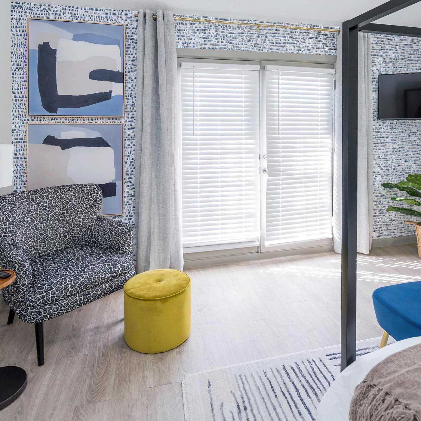
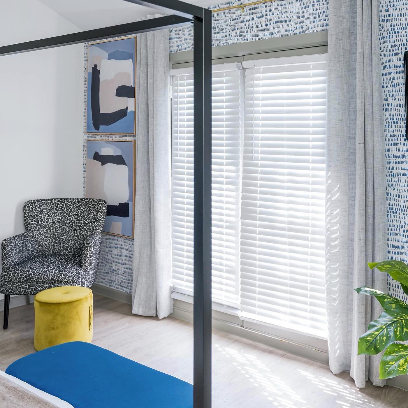
Need some inspiration? This chic and serene bedroom by interior designer Veronica Smith is a fabulous example of an accent wall that pops and plays nice with the rest of the space.
 |  |
| Design by interior designer Veronica Smith; Photography by Right Time Solutions | |
Veronica dressed this wall in our Runes Blue Brushstrokes wallpaper and layered on the style with a pair of blue-hued abstract paintings, breezy floor-length curtains, and golden accents. To keep things feeling cohesive, she placed blue furniture pieces throughout the space – but keeps things interesting by playing with pattern and several shades of blue. And for that extra pop? A small chartreuse ottoman adds the final piece of polish and personality.
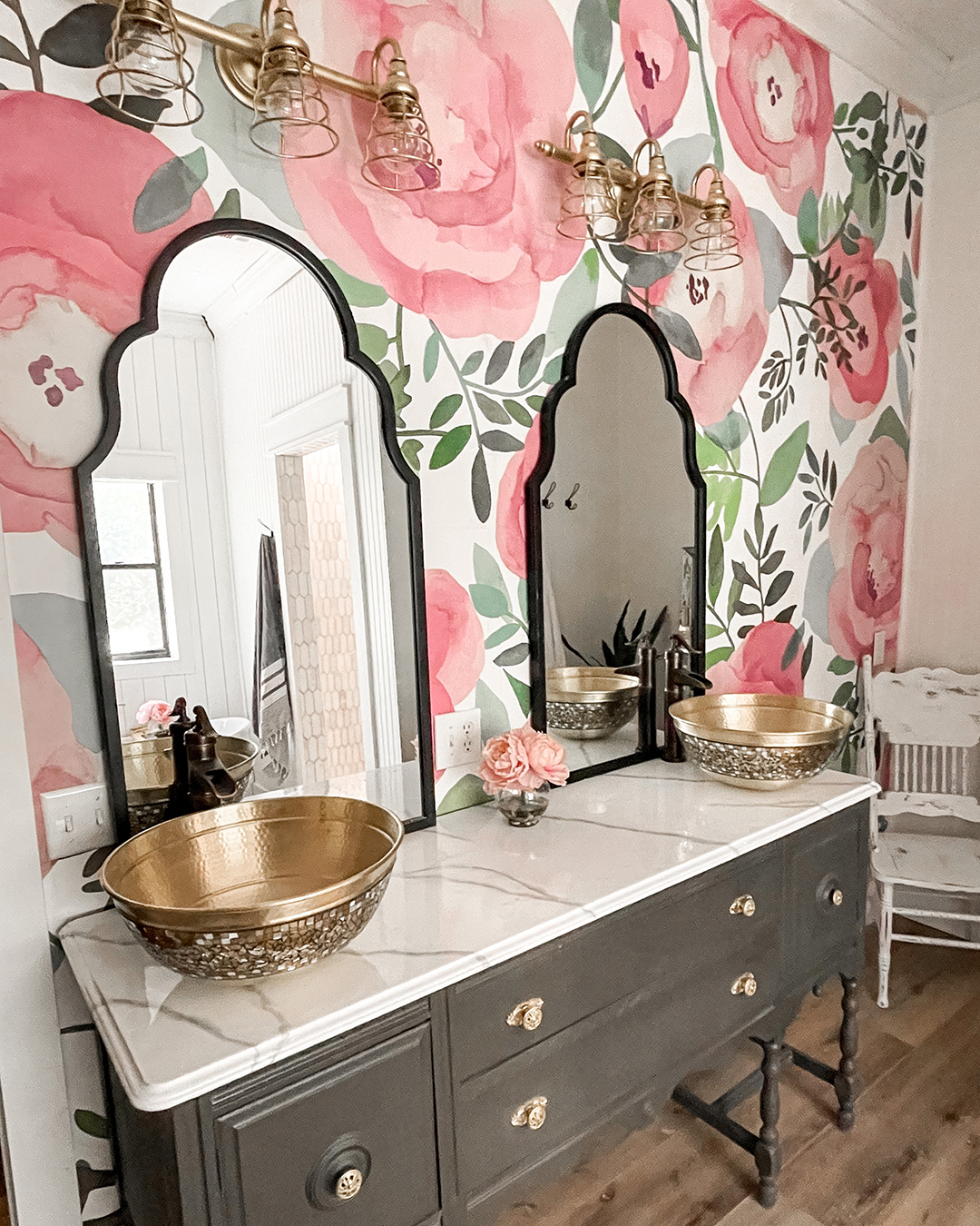
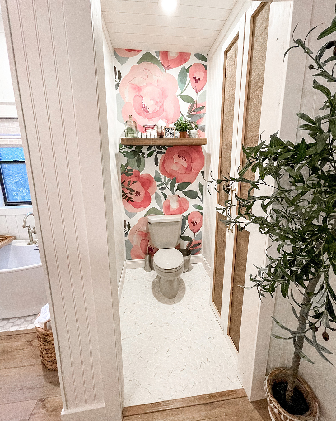
If you’re looking to ease into color, the unifying hue for your space doesn’t necessarily need to be a bright one! Astra Spanbauer redid her entire master bath and chose our Blooming Floral Darling Pink mural to grace her vanity wall (and make an appearance in her water closet too!)
 |  |
| Design and Photography by Astra Spanbauer | |
The large-scale florals add femininity and a gorgeous pop of pink to the space, but the unifying colors are actually the darkest greens of the foliage. These communicate with the black vanity and black fixtures throughout, allowing the pinks to shine while still feeling connected to the greater design scheme.
For a dose of color that can be easily re-styled again and again, consider an abstract wall mural! These designs are more interesting than paint and still allow your style to evolve over time. Our favorite right now? This dreamy blue beauty designed by artist Glenyse Thompson. The soft, watercolor styling is breath-taking, and the hints of green and purple make it easy to switch up your space with new décor accents.
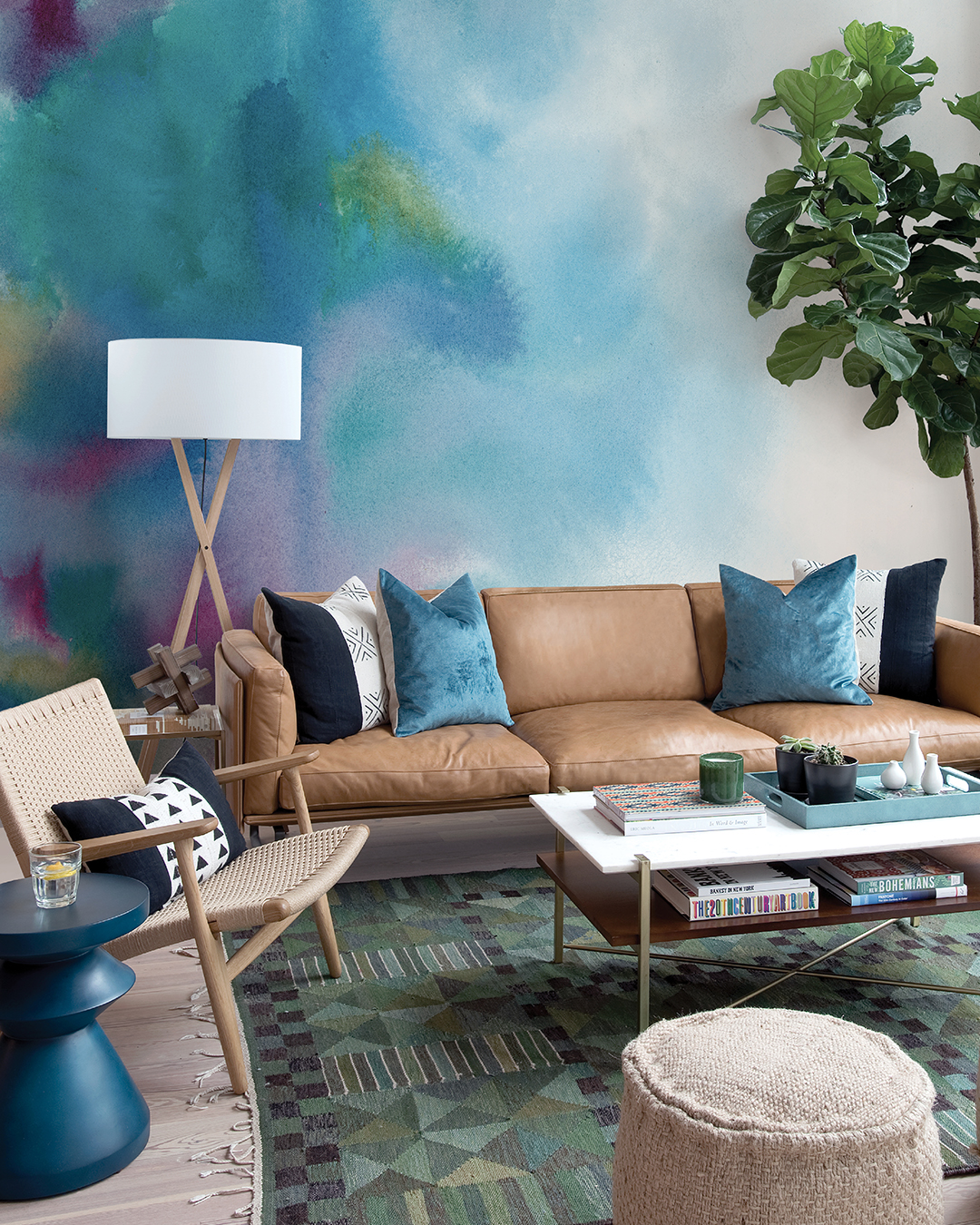 |
| Florida Daybreak wall mural designed by Glenyse Thompson |
Feeling extra adventurous? Transform your ceiling into an accent wall by painting it or wallpapering it in a colorful print!
Soft, Monotone Moments
Ready to take your love of colorful homes to the next level… but not ready to dip your toes in an incredibly bold or loud look? Then these soothing monotone spaces are all the inspiration you need!
Designer Julie Knowles may have created the most relaxing powder room ever with this all-sage space. She wrapped all the walls in our Nara Sage Toile wallpaper, a contemporary take on toile design that retains all its classic charm. She then painted the trim, door, and ceiling in rich sage, enveloping the entire space in its earthen tranquility. A sleek silver mirror and modern black fixtures finish the space with an elevated and modern feel.
.jpg) | .jpg) |
| Design by interior designer Julie Knowles | |
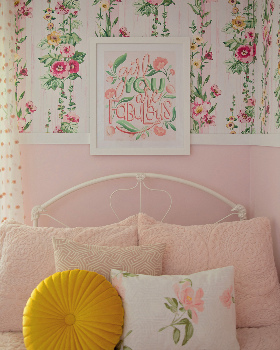
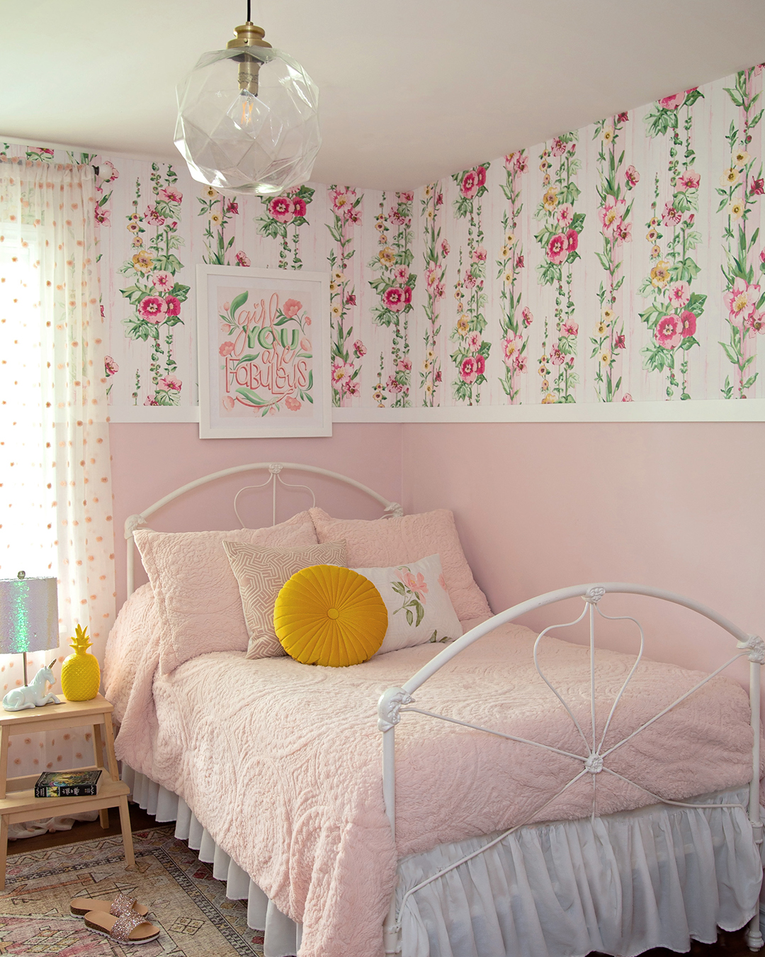
Colorful interior design is an absolute must for kids’ rooms! Interior designer Virginia Fynes fully embraced color in her daughter’s bedroom makeover.
 |  |
| Design and Photography by interior designer Virginia Fynes | |
This cheerful and girly space is a perfect blend of whimsical and polished – a combo that will allow it to grow alongside Fynes’ young daughter. Much of the room’s charm comes from the striped floral wallpaper that decorates the upper wall. The soft pink paint below emphasizes the design’s youthful feel and leaves room for the space to evolve as her daughter gets older.
Paint and Pattern Play
For the biggest colorful interior design impacts, we recommend utilizing both color and pattern! Balancing this interplay might feel intimidating; keeping these key aspects in mind will help you create a bold and harmonious design:
First, you can choose to emphasize color over pattern, or pattern over color. Having both elements strengthens your overall design, but it’s perfectly acceptable to cast one as the lead and the other as the supporting actor.
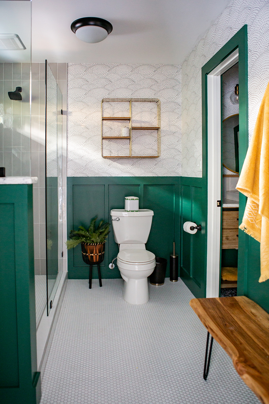
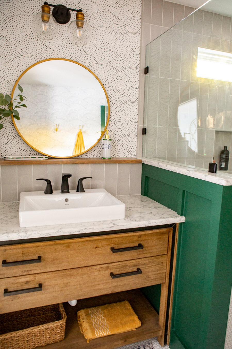
This bathroom by designer Abbey Susanne Richey is a fabulous example of how a simple pattern can elevate a bold color. The emerald-green trim and wainscoting adds richness and sophistication to the space; counterbalanced by the simplicity of the charcoal dotted scallop wallpaper, the color shines without the rest of the room feeling bland.
 |  |
| Design and Photography by interior designer Abbey Susanne Richey | |
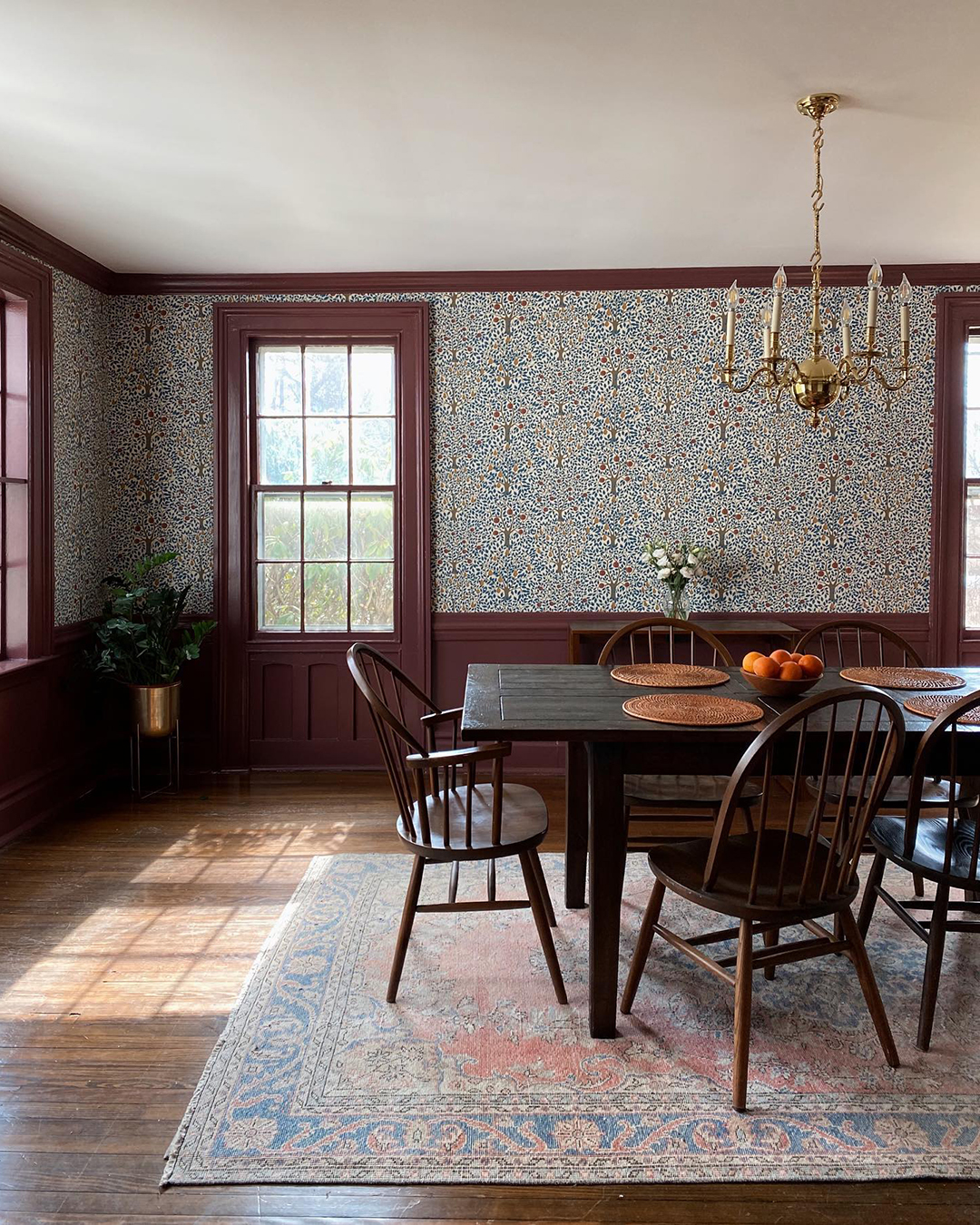
For a slightly more complex look, pull a color from the patterns featured in your space. Morrigan McCarthy brought new life to her 1780 farmhouse dining room with a combination of paint and wallpaper. She chose a tree wallpaper with an unorthodox palette of blues, golds, and reds that offers a modern take on classic country charms.
 |
| Design and Photography by Morrigan McCarthy |
She then painted the room’s trim and wainscoting a rich burgundy that highlights the wallpaper’s existing red features while also balancing the strong blues throughout. Softer blue and pink hues in the area rug balance the darker tones, creating a modern and welcoming entertainment area with lots of traditional charm.
Here’s our last tip: if you love it, it belongs.
You will find staunch proponents of animal print as a neutral; you will also find just as many people who believe animal print should be the boldest element in your space and used sparingly. Neither perspective is right or wrong; it’s whatever speaks to you!
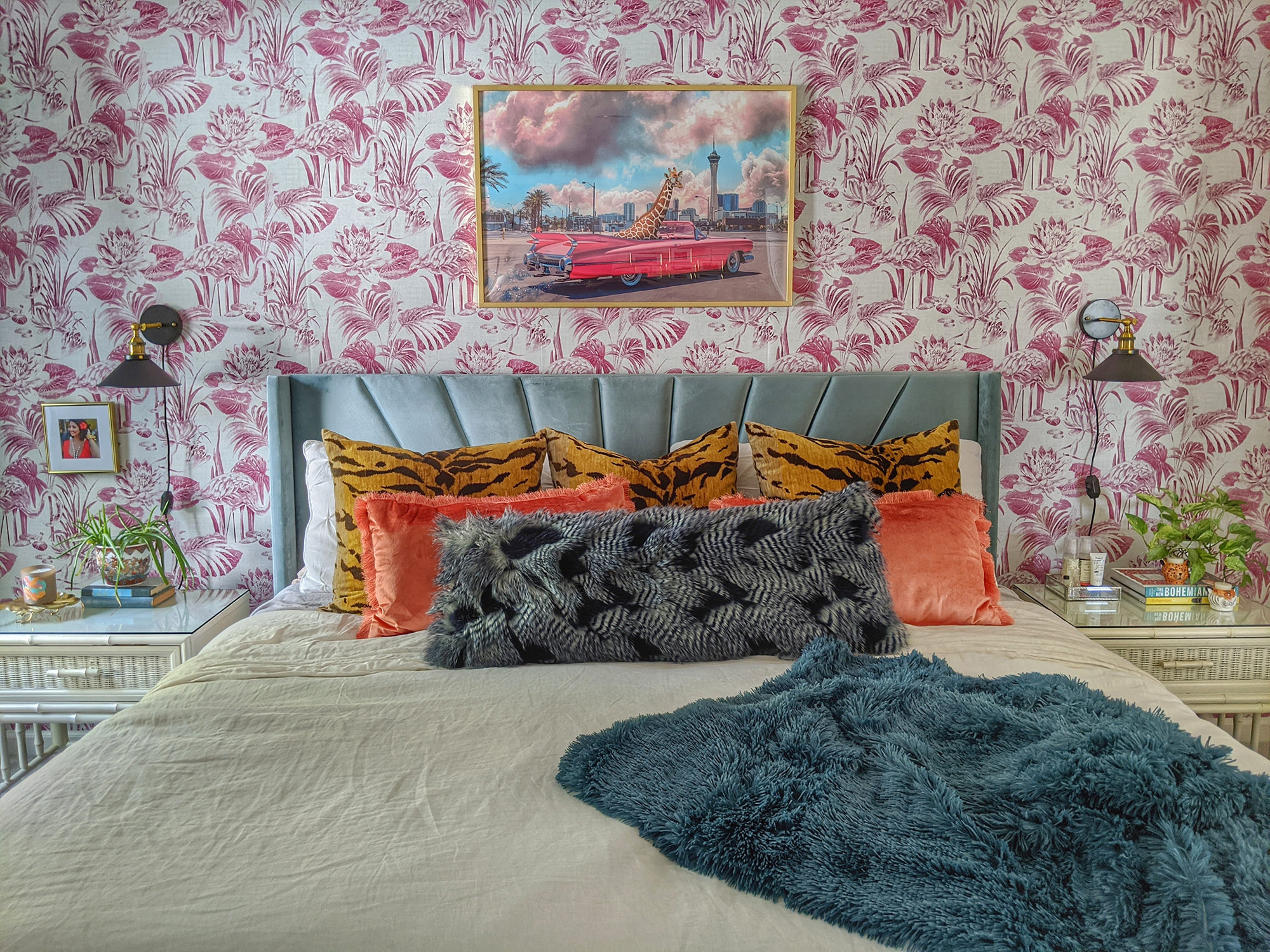 |
| Design and Photography by Amber of The Preppy Bohemian at Home |
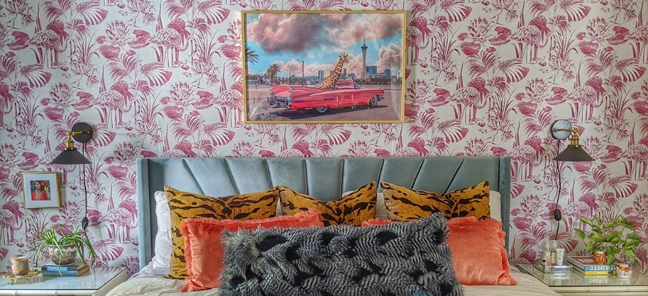
If you love a bold color or print, but are concerned about it overwhelming your space, remember the power of groupings. You can counterbalance the potency of a punchy color, like this pink flamingo wallpaper, by adding touches of blue throughout. A vibrant animal print, like the tiger stripe pillows on Amber’s bed, is softened by pairing it with solid orange throw pillows. If you love something, don’t shy away from it; find a way to balance it so it feels intentional and part of the whole.
Inspired by these colorful homes? Explore the pigmented possibilities for your home by visiting astreetprints.com, or by following us on Instagram and Pinterest!


